What Is My Screen Size? The Complete 2026 Guide
Wondering "what is my screen size" right now? This guide breaks down exactly what screen size means, how it's measured, and the fastest way to find yours without installing anything.
What does "screen size" actually mean?
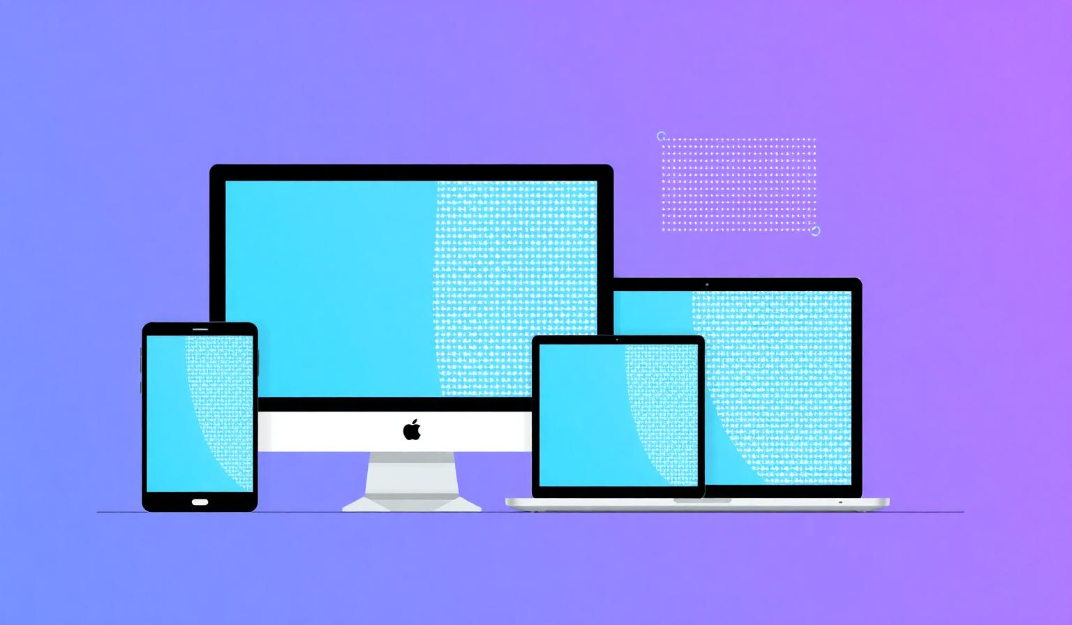
When people ask what is my screen size, they usually mean one of three things: the physical diagonal of the display in inches, the screen resolution in pixels (like 1920 × 1080), or the browser viewport — the area where a webpage is actually rendered. All three are useful, but they answer different questions.
- Physical size — the diagonal measurement of the panel in inches (e.g. 15.6").
- Screen resolution — how many pixels wide and tall the display is (e.g. 2560 × 1440).
- Viewport size — the visible browser area, which shrinks when you open dev tools or resize the window.
The quickest way to check all of these at once is to visit our homepage screen size checker — it reads them directly from your browser and shows them instantly.
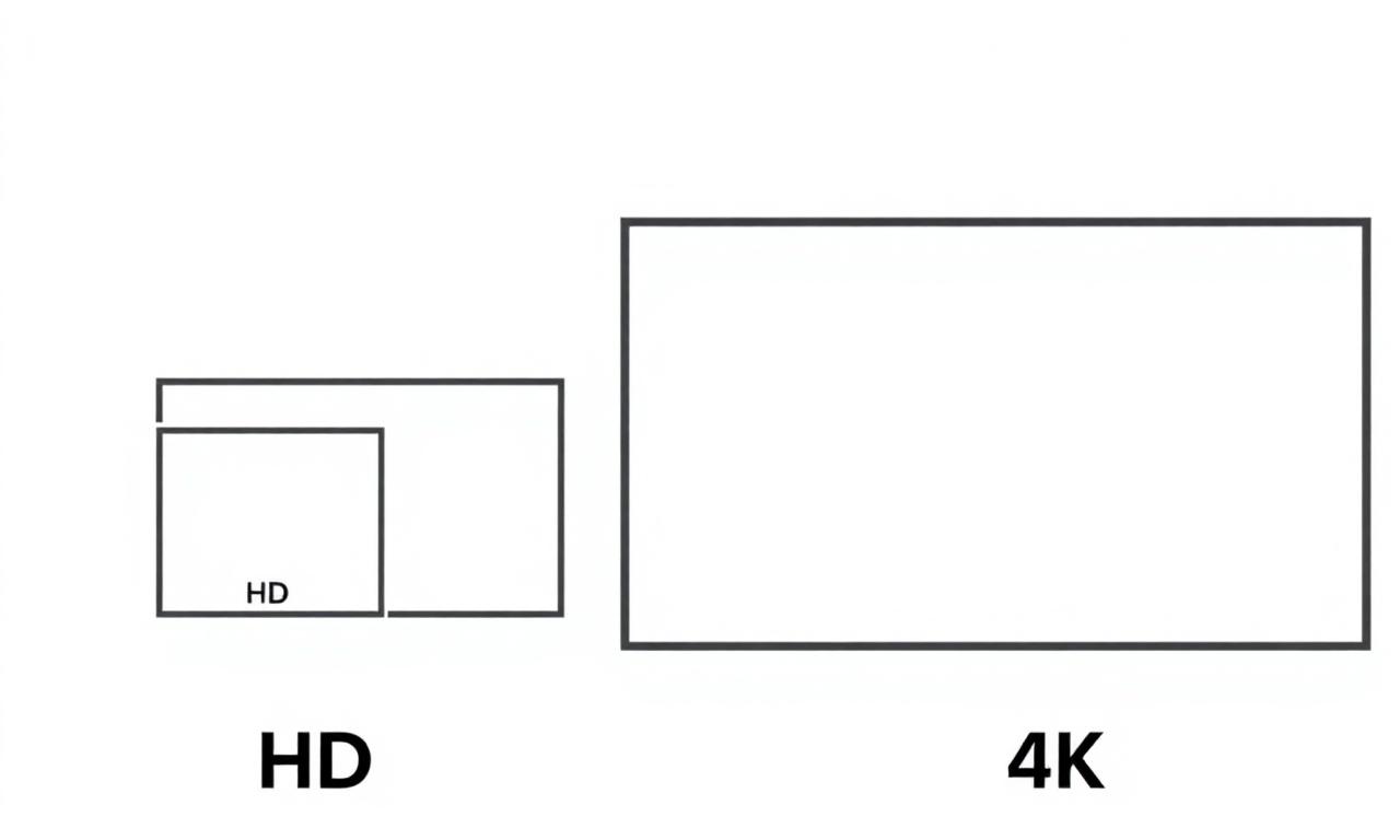
Common screen resolutions in 2026
Here are the screen sizes you'll encounter on most consumer devices today:
| Name | Resolution | Typical Device |
|---|---|---|
| HD | 1280 × 720 | Budget phones, older laptops |
| Full HD | 1920 × 1080 | Most laptops & monitors |
| QHD | 2560 × 1440 | Gaming & pro monitors |
| 4K UHD | 3840 × 2160 | TVs, premium monitors |
| 5K / 6K | 5120 × 2880+ | Apple Studio Display, iMac |
Resolution vs. device pixel ratio
Modern phones and laptops use "retina" displays that pack two, three, or even four physical pixels into every CSS pixel. This multiplier is called the device pixel ratio (DPR). A phone advertised as having a 1170 × 2532 display may report only 390 × 844 CSS pixels to your browser — because its DPR is 3.
That's why two displays can both report "1920 × 1080" while looking dramatically different in sharpness. To see your real DPR, check the what is my screen size tool on our homepage.
How to check your screen size instantly
- Open our screen size checker homepage — it works in any browser.
- Read your width × height instantly at the top of the page.
- Resize your window or rotate your device to see live updates.
- Scroll down to view DPR, aspect ratio, color depth, and orientation.
No installation, no sign-up, and nothing is sent to a server — everything is detected locally in your browser using the standard window.screen API.
Why your screen size matters
Knowing your screen size is useful for buying the right wallpaper, picking a monitor that matches your laptop's resolution, debugging responsive websites, choosing a game's display settings, and reporting bugs to support teams. It's also the first thing designers ask when something looks off — because a layout that's perfect at 1920 × 1080 can break at 1366 × 768.
FAQ
Is screen size the same as screen resolution?
No. Screen size is the physical diagonal in inches; resolution is the pixel count. Two monitors can be the same size but have very different resolutions.
Why does my browser show a smaller size than my display?
Browsers report CSS pixels, not physical pixels. Multiply by your device pixel ratio to get the underlying hardware resolution.
Can I check screen size on mobile?
Yes — open the homepage on any phone or tablet and it will display your screen size automatically.
Ready to find out your exact screen size?
It takes one click — no setup, no tracking.
Check my screen size now →